
Emily Hartley-Skudder, on kitsch and “suspicious pleasantness”

Emily Hartley-Skudder and Hamish Coleman installing Germfree Adolescents at Jonathan Smart Gallery, March 2021. Courtesy of Jonathan Smart Gallery. Photo: Vicki Piper
Becky Hemus: Germfree Adolescents is currently on view at Jonathan Smart Gallery in Christchurch. What was the impetus behind this exhibition and can you tell us about the title?
Emily Hartley-Skudder: The exhibition takes its name from the song and album by British punk band X-Ray Spex, recorded in 1978. Front woman Poly Styrene became an icon for modern-day feminist punk and was known for her synthetic dayglo wardrobe. When I discovered them, the reference was just so perfect. The things Poly Styrene sings about are particularly fitting for my exploration of consumer culture and the ritualistic, sparkling clean space of the bathroom. Reading through other song titles on the album give an uncannily accurate idea of what my work is about: Art-I-Ficial, Plastic Bag, Warrior in Woolworths and The Day the World Turned Dayglo. The song Germfree Adolescent is especially relevant to our current times, with verses like, “You may get to touch her / If your gloves are sterilised / Rinse your mouth with listerine / Blow disinfectant in her eyes.” I was already dealing with very similar visual imagery to Poly’s lyrics, and I like to think I borrowed her words and channelled some of her ferocity, whilst also paying homage to her as a pioneer.
The way that you paint a composition is so technically brilliant and vivid. Then there are these really kitsch installations that mirror and surround them. How have you developed these two, quite different, aspects of your practice?
My practice is grounded in painting—I went through art school at Ilam majoring in painting and really dove deep into the medium. But my process has always relied on collecting found objects to photograph and then paint, so it seemed like a natural progression for the items piled up in my studio to actually be included in the final works. It’s important for me to respond to artefacts that already exist in the world. It began with miniatures but has moved on to stockpiling bathroom basins, bathtubs and retro carpet... I often bring these components into the gallery to create faux-domestic environments, borrowing from the visual language of showrooms. The works in my current show take aspects of this process and shrink them down to a cross-section of wall with an embedded painting and the occasional appendage: a painting within a sculptural painting.
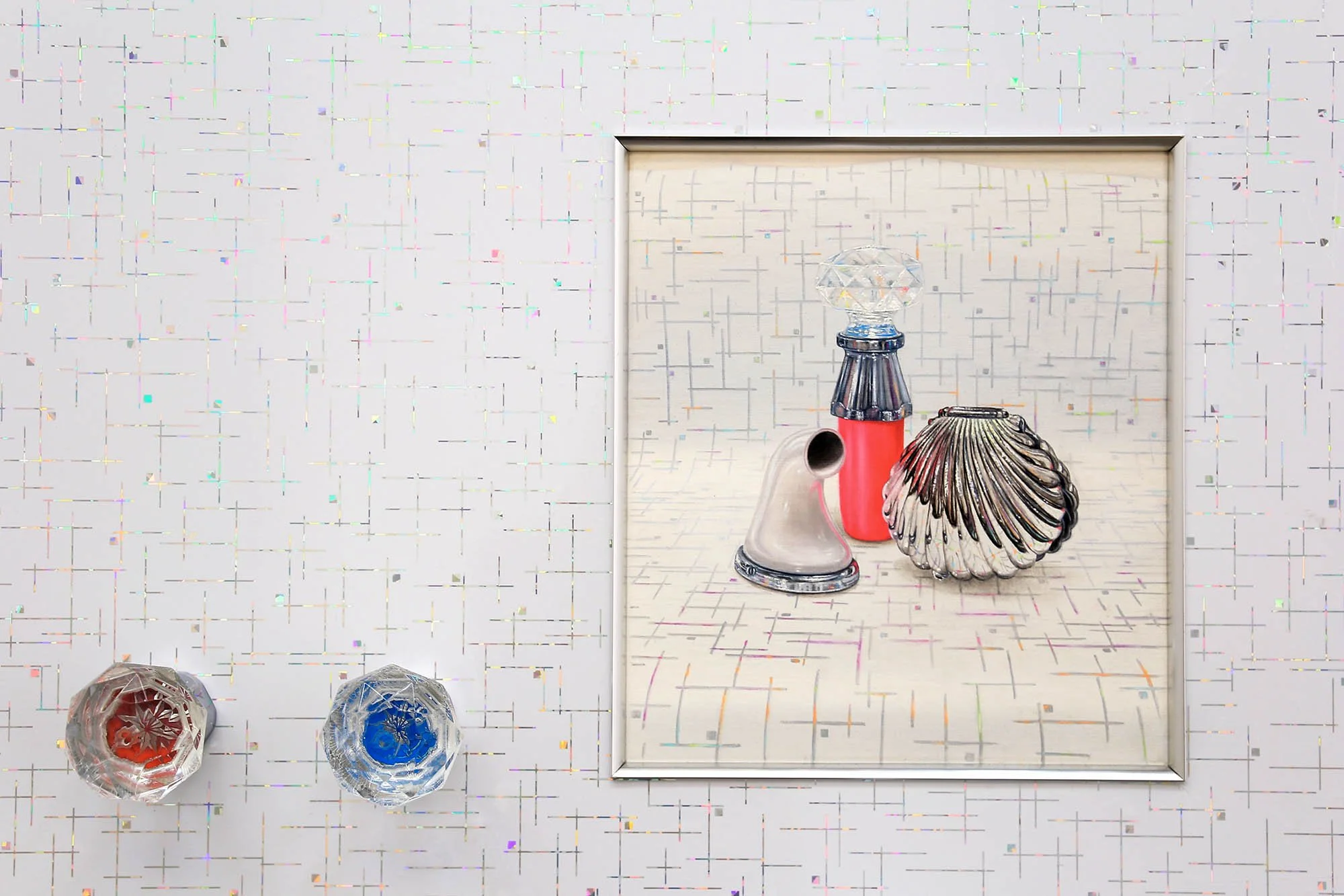
There is one work in particular, Flower Child, that includes new old stock wallpaper and a digital sublimation print on microfibre, framing a circular painting featuring the same design. It’s a cream, brown and orange floral—exactly the type of pattern you might see on 1960s wallpaper or textiles. What is it that draws you to this era?
It must have started with the glorious wallpapers and textures in my grandparent's house. I visited the house recently before it was sold, and realised I’m painfully sentimental when it comes to things. I had an urge to rip up the kitchen lino for future reference. In her book The Artificial Kingdom: On the Kitsch Experience, Celeste Olalquiaga talks about kitsch as a kind of nostalgic commodification, reflecting the human yearning for objects to help recapture the past.
Referencing colours and patterns so distinctly from past time periods draws sharp attention to how taste and fashion change through time, and how consumer culture dictates how we choose to ‘personalise’ domestic spaces. In using these signifiers of bygone taste that have often been renovated-away in the name of progress (think avocado bathroom suites), I want to examine how conservative New Zealanders’ palette for interiors has become, perhaps reflective of the ‘hot market’ and investors buying houses to flip in a few years time. Someone pointed out that I’m re-branding the old bathroom sink that a collector has probably ripped out when re-modelling their home—and selling it back to them as art.
I also like to explore retro aesthetics (with some materials actually being new, fake versions), as a nod to the decoration of the domestic space historically being a common creative outlet for women. At the back of my mind are the historical gender disparities in the art world, and in some ways I’d like to subtly pay homage to women who became homemakers and home decorators instead of artists. That all comes back to looking at the value of everyday, private spaces, and the gender divisions attached to them.
The artworks are pretty and incredibly effervescent, but there is also an element of pathology, pushed to the point where it kind of becomes saccharine and unsettling. Everything is very clean and textural, almost inviting touch. I’ve read that there is a link between the way your artworks manifest and the way that the female body is at times scrutinised and abjectified. Can you expand on this?
My works were once described as “suspiciously pleasant,” similar to the feeling “when you’re a kid and eat Raro juice concentrate powder straight from the packet.” I really love that analogy. The whole repulsion/attraction thing is very satisfying to play with. Some of these recent works use polyethylene foam as imitation brick or leather, which is extremely tactile but kind of repulsive.
In terms of content, I’m interested in our relationship with inanimate objects—what they reveal about us and the expectations we place on our bodies. I began taking my cosmetics, moisturiser bottles and inhalers into the studio, and this expanded to searching out more objects relating to the body online—impractical breast pumps, colourful douching devices and snake-oil beauty tools (like a nose clip that’s meant to reshape your nose?). The absurdity of some of these items is a not-so-subtle dig at marketing campaigns that create gender divisions and pathologise our bodies to sell products. In some ways it’s about the false aspiration for the perfect body; for the perfect home—but only if you buy the best bathroom suite with colour-coordinated cosmetics, and matching paintings, of course.
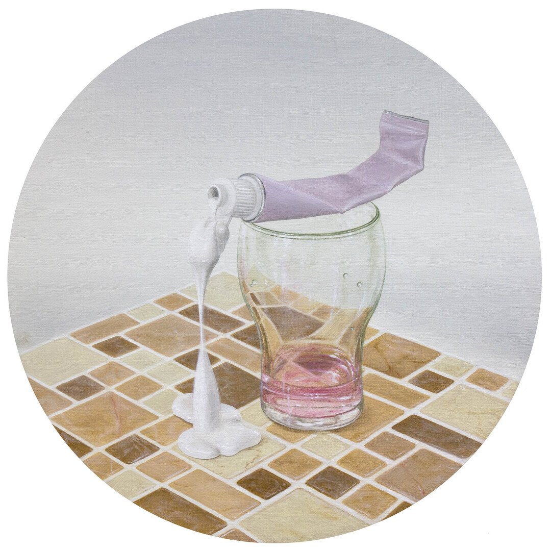
I often look at your artworks and they feel like they have a fetishistic quality to them. Taps and spouts protrude from pristine, isolated surfaces; freshly unwrapped drain plugs sit within quilting on the wall. The painting in Flower Child has a bottle of viscous, clear liquid, like lube, sitting on a tablecloth. Do you think of your artworks as sexy?
I’m glad you have that reading of them! It’s funny how such ordinary objects will often have phallic and yonic connotations—especially in still life arrangements. And taps and plugholes are particularly suggestive. I’m amused by the ambiguity of everyday objects like this and their reading within my work. Is it lube or is it hand sanitiser? Is that a sex toy or a back massager? That could be a penis pump, or is it something you use to spray fertiliser on your garden? I enjoy walking that line and seeing what references people bring to the work, especially when thinking back to the symbolism that was often slipped into historic still lifes.
Your outfits often complement your artworks, especially when you are photographed at events. You might be wearing a pink romper next to an installation of the same colour, a lemon dress and lilac cardigan next to pastel-hued bathroom objects. It feels so blatant that it almost borders on irony, but it also seems to be an authentic way of bringing together the things you love. Can you speak more about clothing and the relationship to your practice?
It’s totally both a bit of humour and irony combined with celebrating things I genuinely love. I often think about how my process of collecting found objects for source material mirrors how I collect vintage outfits. The colors and patterns I wear every day have increasingly merged with my work. I’ve used dresses as backdrops and tablecloths within my paintings, and then worn the dress to the opening. Life imitates art and so forth.
It also hints to the underlying autobiographical nature of my work and how everything merges into one. I think about how we all put on a costume each day and become a slightly different version of ourselves. I almost become different characters according to my chosen outfit, which relates to how I title some of my works, especially the ones with freestanding pedestal basins, such as Buxom Blue, Lemon-Lime Sweetheart and Shy Rose Next Door.
You’ve said before that pastel colours are often ‘dismissed as childish or girly.’ Why do you think this is, and do you feel there is a certain defiance in embracing them so overtly?
I definitely think there can be defiance in how colour is used, especially in Aotearoa with a history of dark, brooding art. I’m fascinated with the gendered nature of some colours and how the whole pink for girls and blue for boys was basically just constructed to sell children’s clothes and toys. I also want to reclaim ‘feminine’ colours like pink; to question why people often consider these as less serious or powerful than seemingly strong, ‘masculine’ colours. Years ago, I did an installation with pale green carpet and pastel pink walls, perspex shelves, matching furniture and fourteen corresponding paintings within the space. When everything was finally installed, a male gallerist commented with a subtly negative tone, “Well... it’s pretty girly.” He wasn’t wrong, but he also proved my point.
How present is the imitation of life and art within your realm? Is your home an IRL version of your artworks?
I wish! No (apart from one of my sink works squeezed onto a wall in the landing). I rent, and at this stage I don’t really think I’ll ever be able to afford to buy my own home to decorate. I spend so much time and energy ‘re-modelling’ areas in gallery spaces and playing home-decorator in my studio, that it would almost feel disingenuous to do it in real life…

Emily Hartley-Skudder, Poly Phonic Swirl, 2020, self-adhesive shelf liner on aluminium composite panel, oil on linen, MDF, aluminium trim, 90 x 90 x 4.5 cm. Courtesy of Jonathan Smart Gallery. Photo: Vicki Piper
“Someone pointed out that I’m re-branding the old bathroom sink that a collector has probably ripped out when re-modelling their home—and selling it back to them as art.”

Emily Hartley-Skudder, Flower Child, 2020–21, new old stock wallpaper on aluminium composite panel, oil on linen, glass, digital sublimation print on microfibre, found taps, aluminium trim, 85 x 53 x 11 cm. Courtesy of Jonathan Smart Gallery. Photo: Vicki Piper

Emily Hartley-Skudder, Poly Styrene, 2021, polyethylene foam on aluminium composite panel, oil on linen, modified handle and loofah, aluminium trim acrylic on canvas, 58 x 58 x 12 cm. Courtesy of Jonathan Smart Gallery. Photo: Vicki Piper

Emily Hartley-Skudder, Germfree Adolescents. Installation view, Jonathan Smart Gallery, March 2021. Courtesy of Jonathan Smart Gallery. Photo: Vicki Piper

Emily Hartley-Skudder, Germfree Adolescent, 2020, 3D vinyl on aluminium composite panel, oil on linen, found taps, aluminium trim, 95 x 71 x 19 cm. Courtesy of Jonathan Smart Gallery. Photo: Vicki Piper

Emily Hartley-Skudder, Germfree Adolescent (detail), 2020, 3D vinyl on aluminium composite panel, oil on linen, found taps, aluminium trim, 95 x 71 x 19 cm. Courtesy of Jonathan Smart Gallery. Photo: Vicki Piper

Emily Hartley-Skudder, Poly Phonic Swirl (detail), 2020, self-adhesive shelf liner on aluminium composite panel, oil on linen, MDF, aluminium trim, 90 x 90 x 4.5 cm. Courtesy of Jonathan Smart Gallery. Photo: Vicki Piper

Emily Hartley-Skudder, Back to School Beau, 2020, self-adhesive shelf liner on aluminium composite panel, oil on linen, found plumbing fixtures, aluminium trim, 61.5 x 61.5 x 10 cm. Courtesy of Jonathan Smart Gallery. Photo: Vicki Piper
Emily Hartley-Skudder, Back to School Beau (detail), 2020, self-adhesive shelf liner on aluminium composite panel, oil on linen, found plumbing fixtures, aluminium trim, 61.5 x 61.5 x 10 cm. Courtesy of Jonathan Smart Gallery. Photo: Vicki Piper

Emily Hartley-Skudder, Midnight Splash, 2021, commercial flooring vinyl samples on aluminium composite panel, grout, oil on linen, found taps, aluminium trim, 66 x 74 x 17 cm. Courtesy of Jonathan Smart Gallery. Photo: Vicki Piper

Emily Hartley-Skudder, Cleans Her Teeth Ten Times a Day, 2021, 3D vinyl on aluminium composite panel, oil on linen, glass, digital sublimation print on microfibre, found towel holder set, gesso and oil on toothbrush, urethane resin, aluminium trim, 78 x 92 x 12 cm. Courtesy of Jonathan Smart Gallery. Photo: Vicki Piper
Emily Hartley-Skudder, Cleans Her Teeth Ten Times a Day (detail),2021, 3D vinyl on aluminium composite panel, oil on linen, glass, digital sublimation print on microfibre, found towel holder set, gesso and oil on toothbrush, urethane resin, aluminium trim, 78 x 92 x 12 cm. Courtesy of Jonathan Smart Gallery. Photo: Vicki Piper

Emily Hartley-Skudder, Pewter Fizz, 2020, polyethylene foam on aluminium composite panel, oil on linen, found plug hole, aluminium trim, 61 x 61 x 3.3 cm. Courtesy of Jonathan Smart Gallery. Photo: Vicki Piper

Emily Hartley-Skudder, Heather Refresher, 2020–21, polyethylene foam on aluminium composite panel, oil on linen, found shower head, aluminium trim, 82 x 60 x 15 cm. Courtesy of Jonathan Smart Gallery. Photo: Vicki Piper

Emily Hartley-Skudder, Heather Refresher (detail), 2020–21, polyethylene foam on aluminium composite panel, oil on linen, found shower head, aluminium trim, 82 x 60 x 15 cm. Courtesy of Jonathan Smart Gallery. Photo: Vicki Piper

Emily Hartley-Skudder, Highly Inflammable, 2020, semi-transparent window vinyl on aluminium composite panel, oil on linen, found hose and taps, aluminium trim, 98 x 60 x 23 cm. Courtesy of Jonathan Smart Gallery. Photo: Vicki Piper